Viewing and analysing GPS traces with R
Nowadays most car drivers use GPS services to reach their destinations. Often this is done via a mobile phone, but soon connected cars will be the norm. As a consequence, the amount of geo-positional data of car trips is continuously increasing. In this blog post I will illustrate how we can use R to analyse and visualise GPS traces. To this end we will use a subset of the open source T-Drive trajectory data sample, which covers one week of 10.357 taxi trajectories in Beijing (Zheng 2011). The dataset is quite large and for our purposes only a subset is needed. I chose trajectories for which the frequency of sampling is “mostly” greater than 1/60 Hz. This leaves us with data from 10 taxis, more than enough for our current purposes.
We will use the following R packages:
data.tablesfleafletggplot2osmdatatmap
Get familiar with the data
To save time, I already prepared a data.table with the following columns: taxi_id, time, longitude and latitude:
knitr::kable(head(traces))| taxi_id | time | longitude | latitude |
|---|---|---|---|
| 1694 | 2008-02-02 13:33:23 | 116.4562 | 39.91068 |
| 1694 | 2008-02-02 13:36:34 | 116.4556 | 39.91747 |
| 1694 | 2008-02-02 13:41:35 | 116.4556 | 39.92942 |
| 1694 | 2008-02-02 13:43:27 | 116.4561 | 39.93937 |
| 1694 | 2008-02-02 13:46:37 | 116.4630 | 39.94133 |
| 1694 | 2008-02-02 13:51:39 | 116.4614 | 39.93250 |
We can start by adding some useful information to it, such as time interval, distance and average speed between successive points for a given taxi driver:
traces[, time := lubridate::ymd_hms(time)]
traces <- unique(traces, by = c('time', 'longitude', 'latitude') )

traces <- traces[order(time), .SD, taxi_id]

traces[, dt_s := as.numeric(time - shift(time)),
  taxi_id]
traces[, dx_m := geosphere::distGeo(cbind(shift(longitude), shift(latitude)), cbind(longitude, latitude)),
  taxi_id]
traces[, speed_kph := dx_m/dt_s*3.6,
  taxi_id]

traces <- traces[!is.na(speed_kph) & speed_kph < 200]
The unique statement makes sure that there are no duplicate rows.
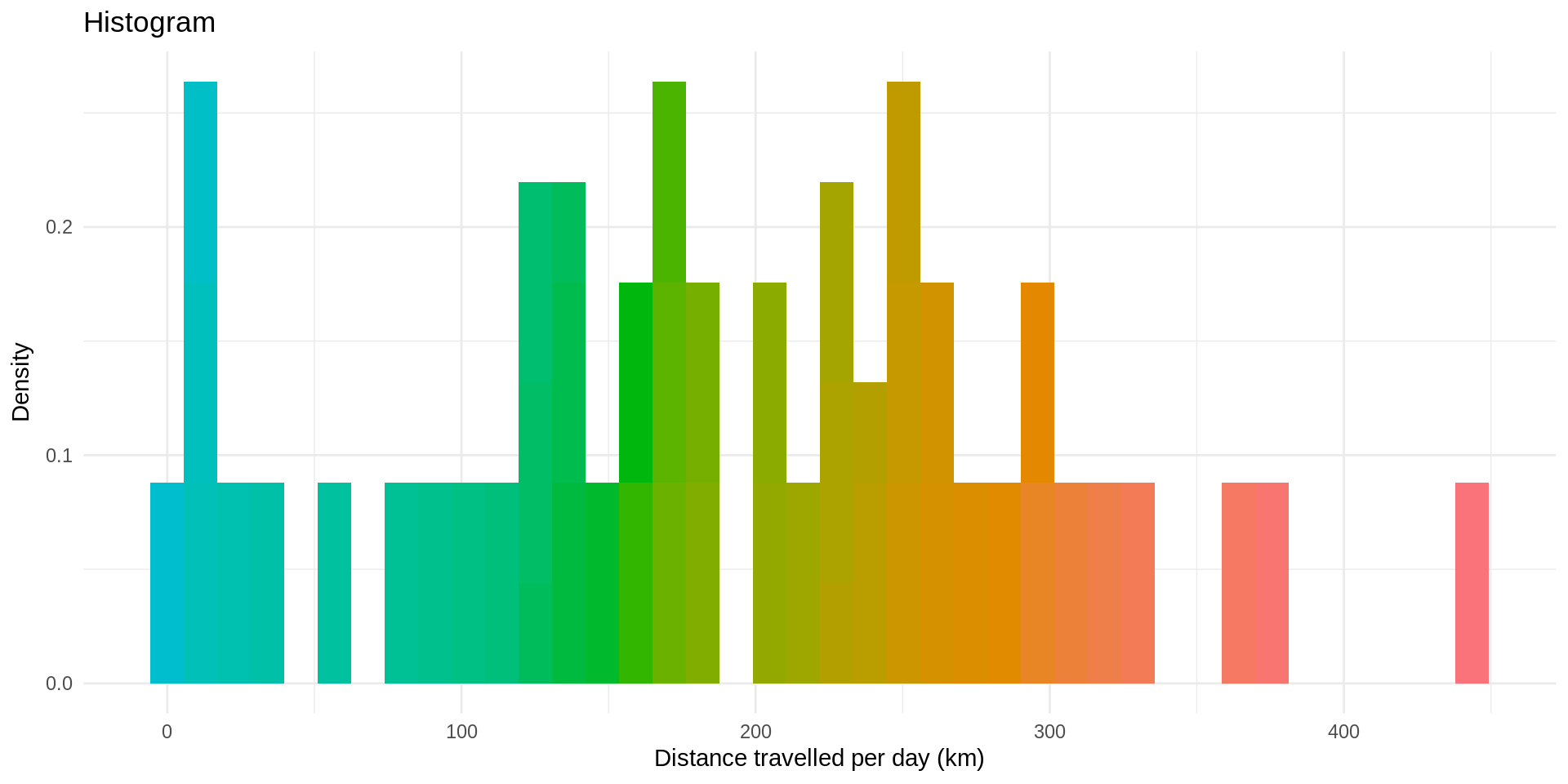
Now, what if we want to know the distance traveled by each taxi driver for each day of the week? Using data.table and lubridate, it is very simple, and using ggplot2 we can visualise the result in a histogram:
traces[, day := weekdays(time)]
daily_distance <- traces[, .(day_dx_km = sum(dx_m, na.rm = TRUE)/1000),
  by = c("taxi_id", "day")]

print(paste0("Average distance traveled per day by taxis in Beijing: ", signif(daily_distance[, mean(day_dx_km)], 5), " km"))
## [1] "Average distance traveled per day by taxis in Beijing: 185.49 km"ggplot(daily_distance, aes(day_dx_km, ..density.., fill = cut(day_dx_km, 100))) +
geom_histogram(bins = 40, show.legend = FALSE) +
scale_fill_discrete(h = c(200, 10))+
theme_minimal() +
labs(x = "Distance travelled per day (km)", y = "Density") +
ggtitle("Histogram")
Many more histograms can be plotted from the data, but you got the gist of it!
Visualise the traces on a map
Using sf and leaflet we can visualise the GPS traces on a map. As a first step, we will use the st_linestring() and st_sfc() functions of the sf package to create a geometry column made of linestrings connecting consecutive points of the data. Then we will plot these linestrings on a map and use a color palette illustrating the speed of the taxis. For practicality, we will limit ourselves to data of one day of the week, say Tuesday:
traces[, lonsh := shift(longitude)]
traces[, latsh := shift(latitude)]
DT_plot <- traces[lubridate::day(time) == 3,][2:.N,
  .(geometry = st_sfc(st_linestring(matrix(cbind(longitude, lonsh, latitude, latsh), nrow = 2, ncol = 2))),
    speed_kph
  ),
  by = c("taxi_id", "time", "longitude", "latitude")]

## define sf_plot as a simple feature collection:
sf_plot <- st_sf(DT_plot)

## define the color palette for the speed profiles
pal <- colorNumeric(
  palette = "YlOrRd",
  domain = sf_plot$speed_kph
)
Now we can plot an interactive map of the traces:
# Display on leaflet
m <- leaflet(data = sf_plot) %>%
  addProviderTiles("CartoDB.Positron")  %>%
  addPolylines() %>%
  addPolylines(color = ~pal(speed_kph), weight = 5) %>%
  addLegend("bottomright", pal = pal, values = ~speed_kph)
m
What about Beijing’s districts?
The package sf is quite powerful. In addition to linestrings, we can also use points and polygons and a variety of functions to investigate relative properties of geometries. For example, we can divide Beijing in its districs and investigate where the taxis travel the most.
To do this, we first need the boundaries of the districts. Following the guidelines of Florian Zenoni’s blog post, we get this information from OpenStreetMap’s API, using the osmdata package:
boundaries <- opq(bbox = 'Beijing, China') %>%
  add_osm_feature(key = 'admin_level', value = '6') %>%
  osmdata_sf %>% unique_osmdata

districts <- boundaries$osm_multipolygons
# set SRID of sf_plot to match that of districts:
sf_plot <- st_set_crs(sf_plot, st_crs(districts)$epsg)
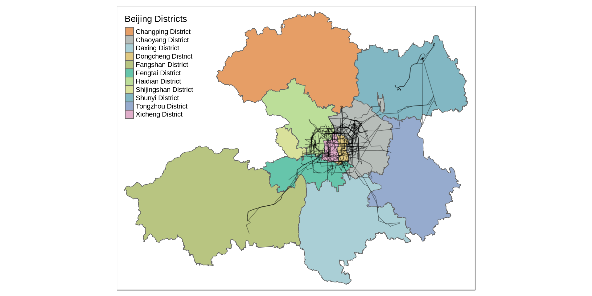
Using tmap, we can now plot the GPS traces on top of the Districts:

That’s great!
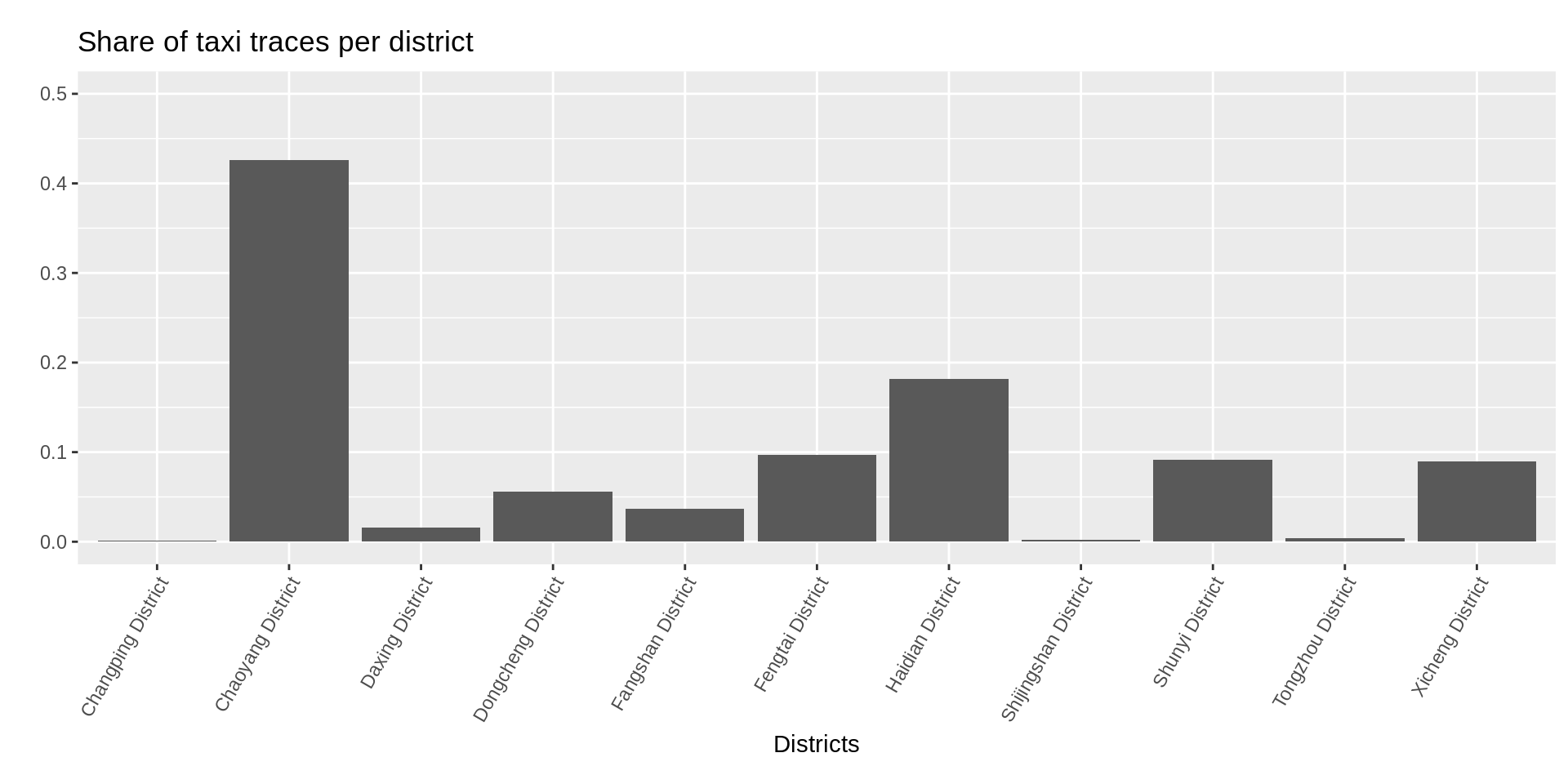
To conclude, let’s find out the most popular districts among taxi drivers on Tuesday. Again, using the functionalities of the sf package, we can do this with just a few lines of code:
# for convenience, we neglect lines that intersect two or more districts
inter <- st_contains(districts, sf_plot)
## although coordinates are longitude/latitude, st_contains assumes that they are planardis_per_district <- unlist(lapply(1:11, function(x) {sum(st_length(sf_plot[inter[[x]], ]))}))
total_dis <- sum(dis_per_district)
bar_data <- data.table(x = districts$name.en, y = dis_per_district/total_dis)ggplot(bar_data, aes(x, y)) +
theme(aspect.ratio=1/3, axis.text.x = element_text(angle = 60, hjust = 1)) +
geom_bar(stat="identity") +
ylim(0,0.5) +
ggtitle("Share of taxi traces per district") +
xlab("Districts") +
ylab("")
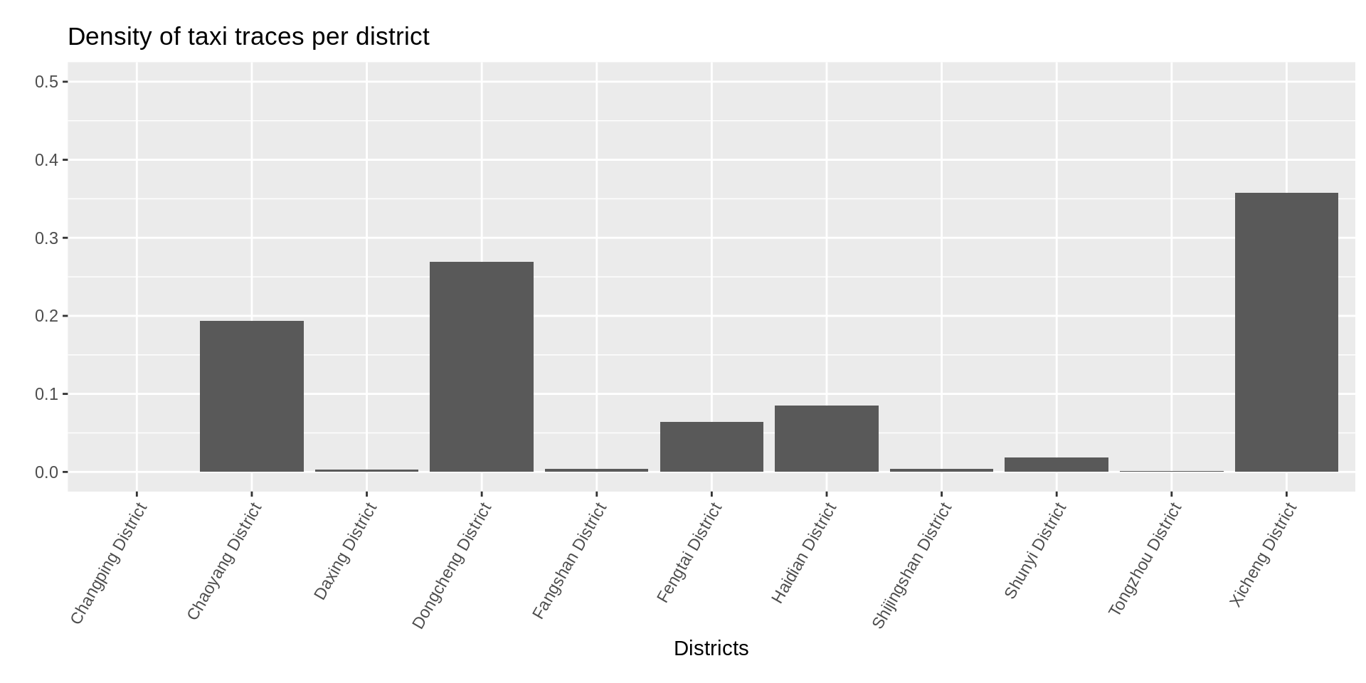
It seems that the most popular distric is Chaoyang District, and by far! Maybe if we take into account the area of districts the result changes:
district_area <- as.numeric(st_area(districts))

# share of traces corrected by area
bar_data[, y := dis_per_district/district_area/sum(dis_per_district/district_area)]
ggplot(bar_data, aes(x, y)) +
theme(aspect.ratio=1/3, axis.text.x = element_text(angle = 60, hjust = 1)) +
geom_bar(stat="identity") +
ylim(0,0.5) +
ggtitle("Density of taxi traces per district") +
xlab("Districts") +
ylab("")
Indeed, we see now that the two central districts that are quite small are in fact the most popular ones.
We could do much more, but that’s it for now!
References
Zheng, Yu. 2011. “T-Drive Trajectory Data Sample.” https://www.microsoft.com/en-us/research/publication/t-drive-trajectory-data-sample/.
