GitHub
The code for the herein described process can also be freely downloaded from https://github.com/fzenoni/london-accidents.
“He didn’t notice that the lights had changed”
Besides being able to “put dots on a map”, R can be used in very interesting ways for spatial analytics. Last month, Stefano performed some descriptive statistics on a Kaggle dataset that includes 9 years of UK accidents. That dataset is so rich that I got inspired in multiple ways.
I will try to offer an answer to the following questions: what if the government wanted to highlight the areas of a city showing some alarming characteristics, with a given statistical significance? What if we wanted to discover what are London’s most dangerous roads or intersections for car drivers, purely by retaining their location and some measurement of severity?
Unfortunately, to analyze the entire London area happens to be too resource intensive, and this is why I will subset an area enclosed in a radius of 4 km. Nevertheless, the method shown stays valid at any scale.
Data preparation
First things first: we load the data and clean it a bit. The fastest way to do it in-memory, while enjoying the functions devoted to tables, is still to use the data.table package, together with the selection of the strictly necessary amount of columns.
# Load data
set <- list.files(path = 'london-accidents-data',
                  pattern = 'accidents.*csv', full.names = TRUE)
cols_to_keep <- c('Location_Easting_OSGR', 'Location_Northing_OSGR', 'Number_of_Casualties')
data <- lapply(set, fread, select = cols_to_keep) %>% rbindlist
# Filter out empty locations
data <- na.omit(data, cols = cols_to_keep)
# Remove duplicates
data <- data[!duplicated(data)]
data.table is nice and all, but since we work with spatial data we’re going to use the sf format, as we did in the past. As sf does not exactly extend data.table, I’m going to cast the table to a data.frame first. Note the CRS, corresponding to the British Ordnance Survey National Grid.
data <- st_as_sf(data.frame(data), coords = c('Location_Easting_OSGR', 'Location_Northing_OSGR'), crs = 27700)As anticipated, this data include accidents over 9 years for the whole of UK. It represents a lot of records, and performance wise, I don’t necessarily have a strategy in place to analyze them all. As a first move, I’m going to select the events that fall inside the boroughs of London’s administrative boundaries. To help with this task, the Kaggle dataset includes the geoJSON of UK’s districts.
I must confess that until very recently, I’ve had mixed feelings concerning this format. Luckily I changed my mind thanks to the discovery of two methods to open and import such a file in R as sf.
The first one is sf::read_sf().
system.time(sf::read_sf('london-accidents-data/Local_Authority_Districts_Dec_2016.geojson'))## user system elapsed
## 7.690 0.611 8.606But the freshest discovery is in fact the geojsonsf::geojson_sf() function from SymbolixAU (check their blog post post here), that serves exactly our purpose, in an even faster way than sf’s method.
system.time(map <- geojsonsf::geojson_sf('london-accidents-data/Local_Authority_Districts_Dec_2016.geojson'))## user system elapsed
## 2.334 0.153 3.166Let’s quickly inspect the map object.
head(map)## Simple feature collection with 6 features and 10 fields
## geometry type: GEOMETRY
## dimension: XY
## bbox: xmin: -2.832457 ymin: 53.30503 xmax: -0.7884304 ymax: 54.72717
## epsg (SRID): 4326
## proj4string: +proj=longlat +datum=WGS84 +no_defs
## bng_e bng_n geometry lad16cd
## 1 447157 531476 MULTIPOLYGON (((-1.268456 5... E06000001
## 2 451141 516887 MULTIPOLYGON (((-1.243904 5... E06000002
## 3 464359 519597 MULTIPOLYGON (((-1.137578 5... E06000003
## 4 444937 518183 MULTIPOLYGON (((-1.317286 5... E06000004
## 5 428029 515649 POLYGON ((-1.637678 54.6171... E06000005
## 6 354246 382146 MULTIPOLYGON (((-2.626835 5... E06000006
## lad16nm lad16nmw lat long objectid st_areashape
## 1 Hartlepool 54.67616 -1.27023 1 93559511
## 2 Middlesbrough 54.54467 -1.21099 2 53888581
## 3 Redcar and Cleveland 54.56752 -1.00611 3 244820281
## 4 Stockton-on-Tees 54.55691 -1.30669 4 204962233
## 5 Darlington 54.53535 -1.56835 5 197475689
## 6 Halton 53.33424 -2.68853 6 79084033
## st_lengthshape
## 1 71707.33
## 2 43840.85
## 3 97993.29
## 4 119581.51
## 5 107206.28
## 6 77770.94Now I would like to extract data relevant to London’s boroughs, but I am bored by having to inspect the map, and the need to learn new geography. I am the laziest member of the team, and as such I refuse to copy-paste 33 names into a list. Therefore, I decided to harvest this Wikipedia page with the rvest package, and use the list to filter the regions of interest.
# Harvest the list of London boroughs from Wikipedia
wiki_london <- xml2::read_html('https://en.wikipedia.org/wiki/London_boroughs')
boroughs1 <- wiki_london %>% rvest::html_nodes('ol') %>% .[[1]] %>% rvest::html_text()
boroughs2 <- wiki_london %>% rvest::html_nodes('ol') %>% .[[2]] %>% rvest::html_text()

list1 <- as.list(strsplit(boroughs1, "\n")) %>% unlist
list2 <- as.list(strsplit(boroughs2, "\n")) %>% unlist
list <- c(list1, list2)

# Special cases to fix
list <- replace(list, list=='City of London (not a London borough)', 'City of London')
list <- replace(list, list=='City of Westminster', 'Westminster')

# Inspect
list
## [1] "City of London" "Westminster"
## [3] "Kensington and Chelsea" "Hammersmith and Fulham"
## [5] "Wandsworth" "Lambeth"
## [7] "Southwark" "Tower Hamlets"
## [9] "Hackney" "Islington"
## [11] "Camden" "Brent"
## [13] "Ealing" "Hounslow"
## [15] "Richmond upon Thames" "Kingston upon Thames"
## [17] "Merton" "Sutton"
## [19] "Croydon" "Bromley"
## [21] "Lewisham" "Greenwich"
## [23] "Bexley" "Havering"
## [25] "Barking and Dagenham" "Redbridge"
## [27] "Newham" "Waltham Forest"
## [29] "Haringey" "Enfield"
## [31] "Barnet" "Harrow"
## [33] "Hillingdon"# Filter map
london <- map %>% dplyr::filter(lad16nm %in% list)
# Unite the boroughs
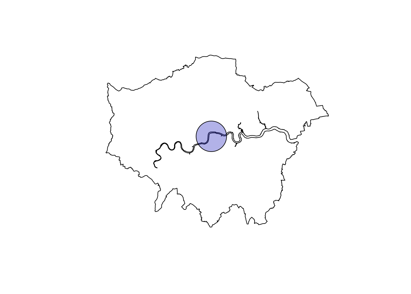
london_union <- london %>% sf::st_union()The London map is ready to be displayed.
plot(london_union)
As mentioned before, I originally wanted to analyze all of London’s data (if not all of UK), but I quickly realized I would have needed to parallelize a large part of the analysis code. I could achieve that for some part, but given that some functions were too complicated to dissect and rewrite, instead, I selected only the data falling into a radius of 4000 m from London’s centroid. For sf aficionados, this last geometrical task is a trivial one.
# Project to British National Grid (http://epsg.io/27700)
data <- data %>% st_transform(crs = 27700)
london_union <- london_union %>% st_transform(crs = 27700)

# Build a circle
center <- st_centroid(london_union)
max_radius <- 4000
london_circle <- st_buffer(center, max_radius)

# Filter data thanks to map
london_data <- data[london_circle,]
This is what we got. I know, I know, it’s a small sample!
# Original amount of data
nrow(data)
## [1] 1281716# Filtered data
nrow(london_data)## [1] 18069# Draw the area
plot(london_union)
plot(london_circle, add = T, col = sf.colors(n = 1, alpha = 0.3))
# Display the accidents as points
leaflet(st_transform(london_data, crs = 4326), width = '100%') %>% addProviderTiles('Stamen.Toner') %>%
  addMarkers(clusterOptions = markerClusterOptions())
Spatial analysis
We’re now ready to inspect some spatial data. I will split the accidents in two categories. This distinction is highly arbitrary: in order to be able to use the final results (i.e. where should Sadiq Khan spend taxpayer’s money to increase security), more understanding of the (meta-)data is needed. But once again, even with a sub-optimal decision at this stage, the method stays valid.
I decided to split the data into Severe and Non-Severe accidents, the former involving more than one casualty, the latter strictly one. Then, to visualize and work on spatial densities, a special kind of object, point pattern dataset, coming from the spatstat package, will be used. The package is not (yet) able to deal with sf, so we’re going to hold our noses and go back for a moment to sp.
# Create spatstat ppp object piece by piece
# Define window
london_owin <- sf::as_Spatial(london_circle) %>% polyCub::as.owin.SpatialPolygons()
# Extract accident coordinates
london_coords <- sf::st_coordinates(london_data)
# Build "marks" or features
london_marks <- as.factor(ifelse(london_data$Number_of_Casualties == 1, 'Non-Severe', 'Severe'))
# Define ppp
london_ppp <- spatstat::ppp(x = london_coords[, 1], y = london_coords[, 2],
                  window = london_owin,
                  marks = london_marks)
With such an object, we can use spatstat to quickly display useful information. We start by showing the fraction of Severe accidents over the total.
# Split the data according to the "marks"
london_splits <- split(london_ppp)
# Compute densities
accident_densities <- stats::density(london_splits)
# Display fractional density
frac_severe_accidents <- accident_densities[[2]]/(accident_densities[[1]] + accident_densities[[2]])
plot(frac_severe_accidents)
This plot is cool, but it just tells us that the Severe accidents are present in that area with a percentage that oscillates between approx. 13% and 19%. Are the highest concentrations meaningful? Are some areas actually more dangerous than others? Aren’t they simply the result of random fluctuations?
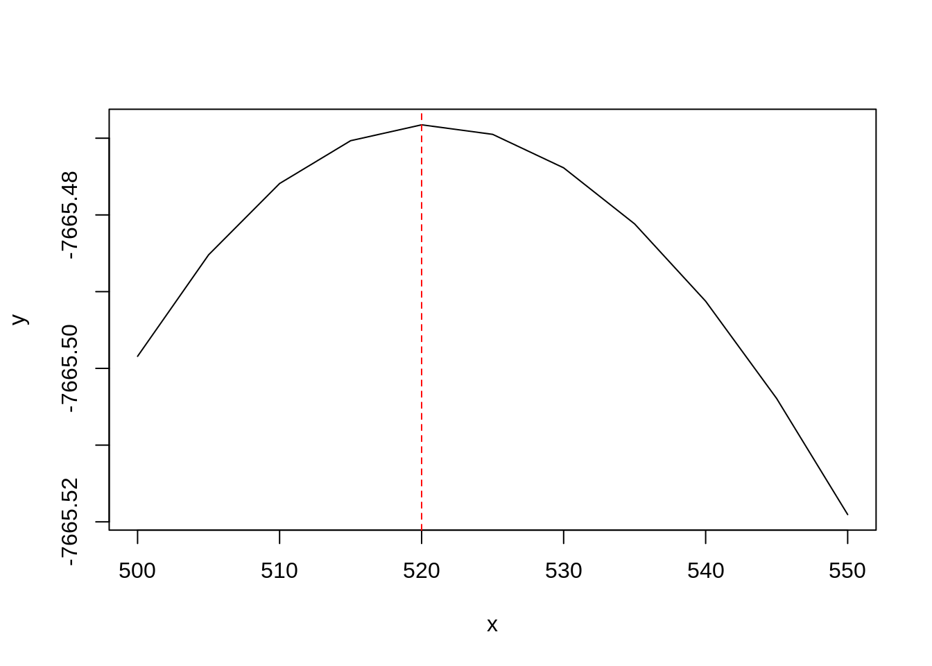
There is one way to find out. The technique I’m going to apply is called spatial segregation, in the context of point pattern analysis. I am going to display the density of accidents - split in two custom categories - thanks to kernel density. A smooth curve will be fitted on the data: highest values will correspond to the location of points, and these values will diminish as the distance from the point increases. However, a crucial parameter must first be determined: the bandwidth. Choose it too small, and the density will be at the maximum exactly where the points are, and zero elsewhere; choose it too large and the density will appear as a blob without any features.
spseg(opt = 1) from the spatialkernel package will assist us in providing the best bandwidth value given our densities. The execution of the workforce function, spatialkernel::cvloglk(), is resource intensive, and we’re going to use parallel computation (as long as the OS is Mac or Linux). I leave out the details, but you can check this blog post for more information.
h <- seq(500,550,5)

os <- Sys.info()['sysname']

if(os == 'Windows') {
  bw_choice <- spatialkernel::spseg(pts = london_ppp,
                     h = h, opt = 1)

  spatialkernel::plotcv(bw_choice); abline(v = bw_choice$hcv, lty = 2, col = "red")

} else if(os == 'Linux' | os == 'Darwin') {

  no_cores <- max(1, parallel::detectCores() - 1)
  cl <- parallel::makeCluster(no_cores, type = 'FORK')
  cv <- parallel::parLapply(cl, h, function(h)
    cvloglk(pts = as.matrix(spatstat::coords(london_ppp)),
            h = h,
            marks = as.character(spatstat::marks(london_ppp)))$cv
  )

  parallel::stopCluster(cl)

  bw_choice <- data.frame(x = h, y = unlist(cv))
  plot(bw_choice, type = 'l')
  max_loglk <- which.max(bw_choice[,2])
  abline(v = bw_choice[max_loglk, 1], lty = 2, col = "red")
} else {
  stop('OS not supported.')
}
This plot indicates the value maximizing the cross-validate log-likelihood function of the bivariate Poisson point process, which describes our point distribution. This value will be carried over in the next step.
Now, how can we assess if a higher concentration of Severe accidents is statistically significant? A classic way to proceed is: 1. to generate a large number of Monte-Carlo simulations that randomly change the location of the accidents while keeping unaltered the ratio Severe/Non-Severe, 2. to compute an appropriate test statistic for every one of them, 3. and then to check how the data test statistic compare to the simulated ones. The test statistic is actually computed for all pixels on a grid covering our region of interest. The following step generates 1000 MC: it took hours to compute, so its output has been loaded for you behind the scenes.
seg1000 <- spseg(
  pts = london_ppp,
  h = bw_choice[max_loglk, 1],
  opt = 3,
  ntest = 1000,
  proc = FALSE)
spatialkernel::plotmc(seg1000, 'Severe')
This plot highlights two p-values levels of the Severe accidents density present in our data: one for p-value equal to 0.05, and the other equal to 0.95. This p-value represents one of the possible statistical significances with which we reject (or not) the null hypothesis of a random distribution of Severe vs Non-Severe accidents. The lower is the chosen p-value, the stricter is our rejection test. In other words, the areas with a p-value below 0.05 show a concentration of Severe accidents that doesn’t seem to be fortuitous (with a one-to-twenty probability of being wrong).
Mind the pedestrian, Richard
For a decision maker, the plot above is not informative at all, because we don’t get to see to which zones the risky areas correspond. We can of course solve this by downloading a raster of the area of interest.
# The download needs lat-lon parameters
mybb <- sf::st_bbox(sf::st_transform(london_circle, crs=4326))
area <- extent(mybb['xmin'], mybb['xmax'], mybb['ymin'], mybb['ymax'])
r <- raster()
extent(r) <- area

# Download from Google Maps
gm <- dismo::gmap(x = r, type = "roadmap", scale = 1, zoom = 13, rgb = TRUE)

# We project the raster back to crs = 27700
uk_proj4 <- '+proj=tmerc +lat_0=49 +lon_0=-2 +k=0.9996012717 +x_0=400000 +y_0=-100000 +ellps=airy +towgs84=446.448,-125.157,542.06,0.15,0.247,0.842,-20.489 +units=m +no_defs'
# method = 'ngb' is necessary to preserve the RGB colors
gm2 <- projectRaster(gm, crs = uk_proj4, method = 'ngb')
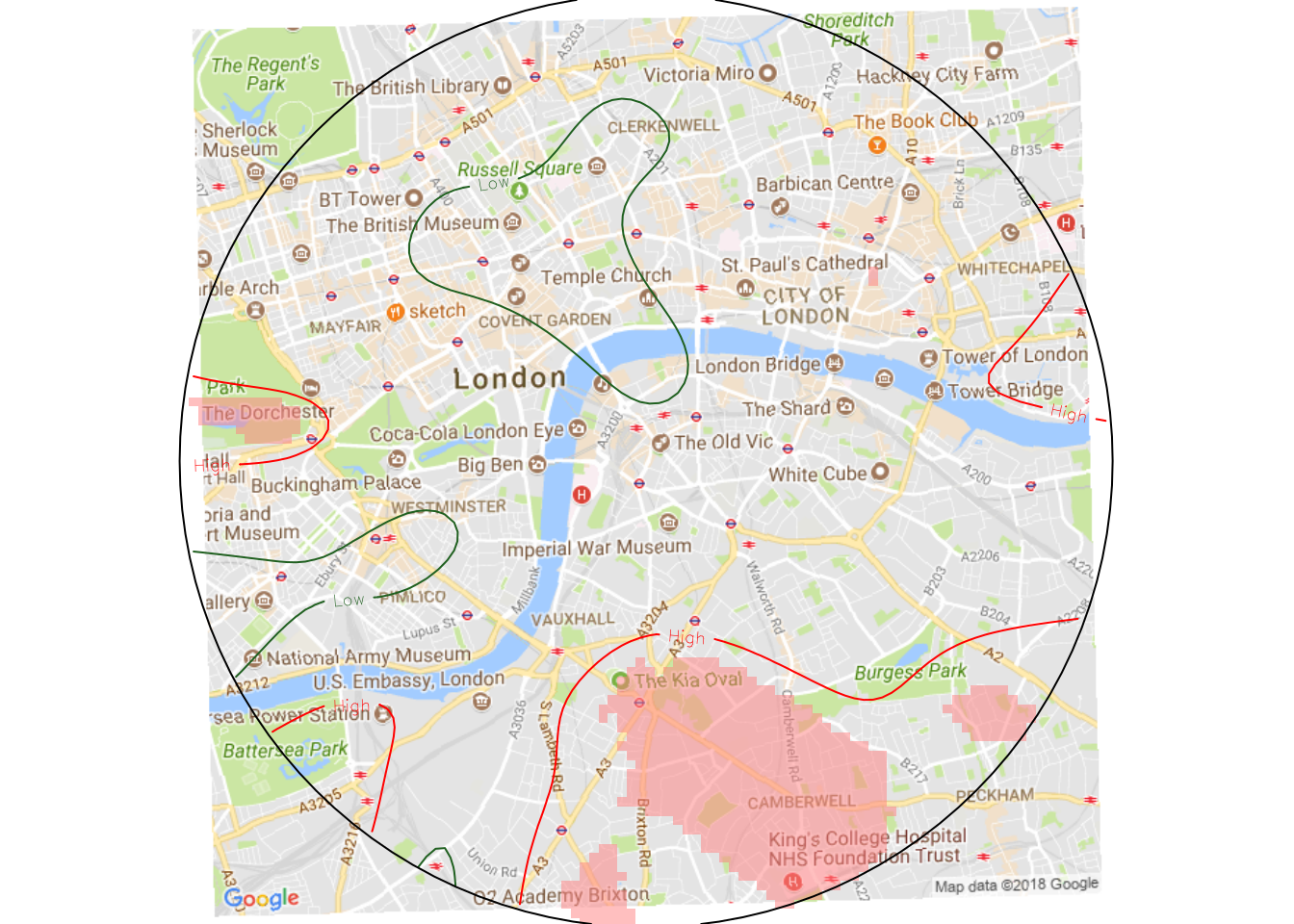
As a final step we generate the complete picture. We choose a p-value threshold of < 0.01, meaning that we have one in a hundred chance of being wrong.
# Rearrange the probability column into a grid
ncol <- length(seg1000$gridx)
prob_severe <- list(x = seg1000$gridx,
                    y = seg1000$gridy,
                    z = matrix(seg1000$p[, "Severe"],
                               ncol = ncol))


# Rearrange the p-values, but choose a p-value threshold
p_value <- list(x = seg1000$gridx,
                y = seg1000$gridy,
                z = matrix(seg1000$stpvalue[, "Severe"] < 0.01,
                           ncol = ncol))
# Create a mapping function
segmap <- function(prob_list, pv_list, low, high){

  # background map
  plotRGB(gm2, interpolate = TRUE)


  # p-value areas
  image(pv_list,
        col = c("#00000000", "#FF808080"), add = T)

  # probability contours
  contour(prob_list,
          levels = c(low, high),
          col = c("#206020", "red"),
          labels = c("Low", "High"),
          add = TRUE)

  # boundary window
  plot(Window(london_ppp), add = TRUE)
}

# Map the probability and p-value
segmap(prob_severe, p_value, 0.13, 0.17)
The chosen probability values in segmap() (0.13 and 0.17) are completely custom and depend on the fraction of events carried by the data. If you analyze a different area, these numbers will certainly be different, as long as you want to keep a good visual effect.
Let me remind once more about the arbitrariness of the Severe and Non-Severe categories defined in this post. We’re just horsing around, so don’t take these results too seriously! That being said, we notice two “dangerous zones” in the center of London. The first is the green patch on the left, which has a concentration of Severe accidents whose density rejects the random distribution hypothesis: that area is actually Hyde Park. Pedestrians, look, and listen before you cross the street! The other critical area covers a large area that includes the Camberwell district, plus some other streets that a Londoner could maybe identify.
Acknowledgments
I couldn’t have written this post if it weren’t for the kind help of Barry Rowlingson (follow him on Twitter). His Datacamp course was an invaluable resource to learn about spatial analysis with R.
